Table of Contents
Themes
As with all the 'Alternative' sites produced by me, this site includes colour themes that can be swapped out at will. All colours used on the site are held in a single cascading style sheet that is configured and loaded as the page loads.
This page explains how to use them, their structure and how to create your own. Of course, if you are happy to use the default grey theme then you do not need to do anything.
Available Themes
The available themes are:
Dark Alternatives
These colours are also available as dark versions by preceding the name with dark- as shown below1):
dark-grey, dark-cranberry, dark-russet-orange, dark-lilac, dark-warren-tavern, dark-martini-olive, dark-charry-tomato, dark-chili-oil, dark-crocus-petal, dark-nebulas-blue, dark-red-pear, dark-spring-crocus and finally dark-valiant-poppy.
The dark-grey theme is also provided as an alternative to the default theme.
Setting a Theme
To set a theme for your site, simply edit the “Theme”:“”, entry in cmxConfig - line 43. Carefully enter the desired theme from the coloured list in lower case and hyphenated; note (and precede it with dark- if required). If you make a mistake, it will be ignored and the default theme will be used.
Save the file.
To see the changes you will need to close and re-open your browser window.
Changing the Theme
Please refer to the page dealing with configuring the site.
The Theme Structure
The themes themselves have been completely re-written to use just nine colours using on the monochromatic colours based on the primary colour. These are then numbered color1 to color9 - dark to light for the main theme, light to dark for the dark variations.
Variables
These colours have been obtained from https://icolorpalette.com. The first section of the default theme specifies the values for the variables used throughout the rest of the stylesheet. These are therefore available as css variables throughout the site - var(--color1) to var(--color9). None of the colours necessarily match the theme colour. A number of other variables are defined but all these use the above variables. This means that a change to --color5; for example will affect multiple styles throughout the sheet.
Background & Foreground styles
This section defines the basic styles used throughout the site.
- .ows-theme0 - Applies the parent containers themes to foreground and background.
- .ows-theme1 - shows the lightest text on the darkest background
- .ows-theme2 - shows the lightest text on the next lightest background
- .ows-theme3 - shows the lightest text on the next lightest background
- .ows-theme4 - shows the lightest text on the next lightest background
- .ows-theme5 - shows the darkest text on the next lightest background2)
- .ows-theme6 - shows the darkest text on the next lightest background
- .ows-theme7 - shows the darkest text on the next lightest background
- .ows-theme8 - shows the darkest text on the next lightest background
- .ows-theme9 - shows the darkest text on the next lightest background
Hover Colours
.ows-theme1-hvr to .ows-theme9-hvr
This uses the same colour combinations as for the above but only when the mouse is hovering over them. No effect would be seen if an html element had the class ows-theme5 ows-theme5-hvr.
Text only colours
To change just the foreground colour, nine styles are provided - .ows-theme1-txt to .ows-theme9-txt. They should be used after setting the main colour, i.e. class="ows-theme5 ows-theme3-txt". This ensures that the text colour overrides the default text colour set with .ows-theme5.
Border Colours
ows-theme1-bdr to ows-theme9-bdr can be used to put borders around elements but you will also need to use w3-border, w3-topbar, w3-bottombar, w3-leftbar or w3-rightbar as well to actually turn on the borders.
Other features
The style sheet also includes a small number of text hover classes, border hover classes and some gradients.
Not all styles are used - you should experiment to find your ideal combination
Below is the default grey theme that is used if no other theme is specified.
- theme.css
/*  Theme colour variables */
:root {
    --baseR: 127; --baseG: 127; --baseB:127;
    --color1: #191919;
    --color2: #333333;
    --color3: #4c4c4c;
    --color4: #666666;
    --color5: #7f7f7f;
    --color6: #999999;
    --color7: #b2b2b2;
    --color8: #cccccc;
    --color9: #e5e5e5;
    --modal: rgba(var(--baseR), var(--baseG), var(--baseB), 0.3);
    --menu:  rgba( var(--baseR), var(--baseG), var(--baseB), 0.8);
    --shadow1: 0 0.3em 0.3em -1px var(--color5);
    --shadow2: 0.2em 0.2em rgb(var(--baseR), var(--baseG), var(--baseB), 80%), 0.6em 0.6em 0.6em rgb(var(--baseR), var(--baseG), var(--baseB), 50%);

    --gradient-down: linear-gradient( 0deg, var(--color7), var(--color5));
    --gradient-up: linear-gradient( 0deg,  var(--color5), var(--color7));
    --gradient-ltr: linear-gradient( 90deg,  var(--color7), var(--color5));
    --gradient-rtl: linear-gradient( 90deg,  var(--color5), var(--color7));
    --gradient-databar: linear-gradient( var(--color5) 0%, transparent 20%, transparent 80%, var(--color5) 100%);

}

/*  Combination colours foreground/background */
.ows-theme0 { color: inherit; background: inherit;}
.ows-theme1, .ows-theme1-hvr:hover { color: var(--color9); background-color: var(--color1)!important;}
.ows-theme2, .ows-theme2-hvr:hover { color: var(--color9); background-color: var(--color2)!important;}
.ows-theme3, .ows-theme3-hvr:hover { color: var(--color9); background-color: var(--color3)!important;}
.ows-theme4, .ows-theme4-hvr:hover { color: var(--color9); background-color: var(--color4)!important;}
.ows-theme5, .ows-theme5-hvr:hover { color: var(--color9); background-color: var(--color5)!important;}
.ows-theme6, .ows-theme6-hvr:hover { color: var(--color1); background-color: var(--color6)!important;}
.ows-theme7, .ows-theme7-hvr:hover { color: var(--color1); background-color: var(--color7)!important;}
.ows-theme8, .ows-theme8-hvr:hover { color: var(--color1); background-color: var(--color8)!important;}
.ows-theme9, .ows-theme9-hvr:hover { color: var(--color1); background-color: var(--color9)!important}

/* Gradients ~ You may wish to adjust the foreground colours used */
.ows-theme-grad-down            { background-color: var(--gradient-down);color: var(--color1)!important}
.ows-theme-grad-down-hvr:hover  { background-color: var(--gradient-down);color: var(--color9)!important}
.ows-theme-grad-up              { background-color: var(--gradient-up);color: var(--color1)!important}
.ows-theme-grad-up-hvr:hover    { background-color: var(--gradient-up);color: var(--color9)!important}
.ows-theme-grad-ltr             { background-color: var(--gradient-ltr);color: var(--color1)!important}
.ows-theme-grad-ltr-hvr:hover   { background-color: var(--gradient-ltr);color: var(--color9)!important}
.ows-theme-grad-rtl             { background-color: var(--gradient-rtl);color: var(--color1)!important}
.ows-theme-grad-rtl-hvr:hover   { background-color: var(--gradient-rtl);color: var(--color9)!important}

/*  Gradients */
.ows-theme-grad-down, .ows-theme-grad-down-hvr:hover { background: var(--gradient-down)!important; color: var(--color2)!important;}
.ows-theme-grad-up, .ows-theme-grad-up-hvr:hover { background: var(--gradient-up)!important; color: var(--color2)!important;}
.ows-theme-grad-rtl, .ows-theme-grad-rtl-hvr:hover { background: var(--gradient-rtl)!important; color: var(--color2)!important;}
.ows-theme-grad-ltr, .ows-theme-grad-ltr-hvr:hover { background: var(--gradient-ltr)!important; color: var(--color2)!important;}
Creating your own theme
The site that I use to generate the colour scales is iColourpalette and then use the 'Monochromatic Colours.
- Simply copy one of the existing theme in the css/themes/ folder and rename it to you desired theme name.
- For the three variables: –baseR, –baseG and –baseB, enter the decimal value for the red, green and blue components of your chosen theme colour.3)
- For each of the variables ows-color1 to ows-color9, change the hex code to the desired colour. You should always arrange the colours in ascending or descending order to ensure contrasts are suitable.
- Save and check your theme by setting it in cmxConfig.
If the menu colours don't have sufficient contrast, you may need to edit two of the predefined classes: .ows-theme5 and .ows-theme5-hvr:hover.
Initially change the color variable used from 1 to 9 or vica-versa. Save and recheck your theme.
All themes provide access to the two styles either side of .ows-theme5 so that you can also adjust these if required.
If you find that other styles also need tweaking then you can copy theme from the master theme theme.css and adjust as required.
Screenshots
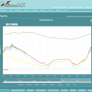
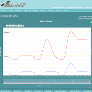
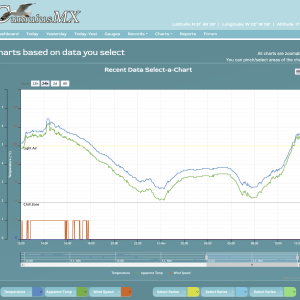
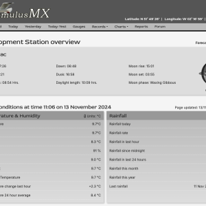
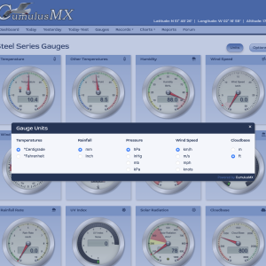
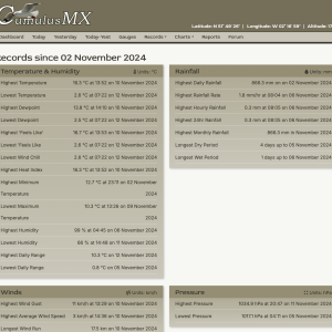
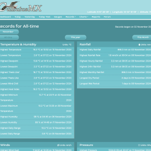
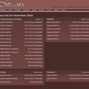
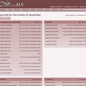
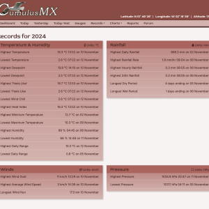
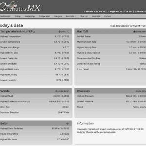
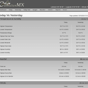
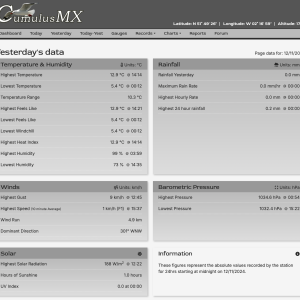
These are screenshots of the current alternative website. They show a range of different themes and can all be clicked to show full size versions.

